 Today is the third and final portion of the mini-workshop on Branding I began last Sunday.
You've all done your homework, right? Read Part 1 to get an overview, did the creative thinking exercises in Part 2? If so, we're ready to get into the specific ELEMENTS of branding. This is a "mini" workshop, which means I can't elaborate quite as much unless you ask me to, because nobody wants to read a blog that goes on forever. :) If you have any questions, please leave me a comment and I'll respond.
Defining Your Theme:
(1) Who’s your target audience? YA, paranormal (be specific, i.e. vampires?), home & hearth, romantic suspense? If you did Part 2, you should know that it's VERY important that you don't just give a "knee-jerk" response to this question. Knowing your target audience should determine the “tone” of your brand, and help you target market effectively:
Here's some examples:
"Cartoon Network" appeals to kids with loud, bright colors, smart-mouth kids and goofy grownups
"Bones" appeals to the curious and intelligent TV watcher with a brainy but vulnerable heroine, sexy but control-freak hero with a soft side (he played Angel on Buffy, btw), great music, action-packed intro, etc.
"Firefly" appeals to the sci-fi crowd who likes to think outside the box with witty writing, a futuristic space-based society with an “old-timey” Western theme. Specialized, but very effective.
Spend a little time analyzing the commercials on TV – who are they targeting? Housewives, career women, men? It’s not hard to figure it out once you understand the basics of target marketing.
(2) Theme Elements:
(a) Your website. If you don’t have one, get one! WEBSITES ARE A MUST! If you’re serious about getting published, you need one now – whether you’re published or not. Not only will you be more prepared when you get “The Call”, you’re showing that you believe you’re going to get “The Call”, and showing to anyone who may be interested (agent, editors) that you understand how important marketing can be.
(Let me tell you a little story about how important websites can be: When I was searching for an agent, I received interest from my top three choices. All three went to my website before contacting me. I know, because they told me. And when I discussed representation with my "dream agent", the one who I ended up choosing to represent me, she actually went to my website WHILE we were talking, so she could read excerpts from my other manuscripts and discuss those with me as well. I have to ask myself, "What if I didn't have a website? Would their interest have stopped before they reached for the phone and dialed my number?" I'll never know, but I have to think that having that website in place helped my chances. )
Now let's talk some website specifics:
(b) Colors and shapes to consider by genre:
Urban fantasy – dark shades; blue and black, gritty city scenes, streets, buildings
Romantic comedy – light shades: pinks, blues, yellows, greens, fun shapes like circles, swirls
Romantic suspense – richer shades: dark reds, golds, eyes, partial faces, crime tape
Historicals – depending on the time period, but you can’t go wrong with jewel tones (ruby red, sapphire blue, golden topaz); rich fabrics like silk and velvet; lush gardens, Victorian jewelry (brooches, cameos, pearls)
Paranormals –the range is wider. If you’re going to write about vampires, red and black is the obvious choice - bats, coffins, crosses. Shapeshifters seem to call for blues and grays, foggy images, mist. Werewolves evoke blacks and browns, the moon, night landscapes.
Fantasy – again, a wider range. Elves and fairies would call for greens and lighter shades, mythical imagery. Science fiction usually calls for bolder colors –purples, reds, dark blues, stars, galaxies, spaceships.
(c) Fonts: a very important element, because it’s a “visual” representation of your actual writing (for use on business cards, signature lines, website headers). Here are some examples of how fonts send subliminal signals (I wish I could show the ACTUAL fonts, but blogger's font choices are limited):
Bernhard Fashion has an “upper crust” feel
Coronet is a lovely, flowing font
Tempus Sans reflects an older historical feel
Copperplate reflects and “old-timey” feel
Lansbury is great for romantic suspense
Pull up your font window in Word and experiment before choosing a font for your website and stationary. Above all, make sure it’s readable, and not just pretty. The body of your text in a website should be in a basic, readable font like Arial. Don't get carried away with a font so much that your website visitors can't read the body of your text without squinting.
(3) Taglines: Taglines are fun, but they’re not actually necessary. Many big name authors do NOT have taglines. But if you want one, go for it. If you’re stuck, look for quotes you like. Try not to be so general that your target market gets diluted, and be consistent with what you’re trying to deliver. It’s not enough to just use adjectives – be more creative.
Examples:
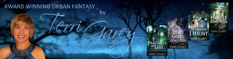
Terri Garey – “A lighthearted look at the dark side.”
Tawny Weber – “Hot, sassy romance… it’s all about the attitude.”
Cheryl Wilson - “Epic fantasy. Powerful romance. Embrace the magic.”
(4) Signatures: Come up with a short signature to use in your email correspondence, and USE it. Add it on to the end of every email. Keep it short, and try to make it a representation of your philosophy in life, or a representation about your writing. One of my favorite signatures is: “Come to the dark side. We have cookies.” Even your “username” can reflect your brand. My username on various loops is either “Spooky” or “SpookyChick”.
However, don't make your signature so long that people won't read it. More than three lines and it becomes just a bunch of words, losing its effectiveness as a marketing tool.
(5) Your online presence: If you’re a loop, be conscious of what you say. If you’re a flamer, too controversial, too abrupt, whatever… believe me, people WILL remember you, but it won’t be in the way you want them to. The greatest website in the world, with all the bells and whistles, won’t help you if you’ve presented yourself badly in the cyber world.
And that's it! IMHO, "branding", for a writer, is about establishing a CONCEPT, and offering it VISUALLY.
Any questions?
Thursday, September 13, 2007
Branding: Keeping It Simple Part 3
Subscribe to:
Post Comments (Atom)


6 comments:
Thanks, Terri! Great ideas!!!
I thought your information was so good, it had to be shared. I posted a link to your website on my chapter's e-loop so we all could benefit from your wisdom.
Thanks again.... now I have to go update my website....
I'm in the process of updating my website, so your blog couldn't have come at a better time. BTW, I think this would make a great workshop at Natl's!
Thanks, Olivia - share away! :)
I'm glad you're finding it useful, Kim, and good point about Natl's. The one workshop I attended on this was far too vague for my tastes - I need concrete examples, so I developed my own. Thanks for the suggestion!
"Come to the dark side. We have cookies."
That's so perfect. I love it! :-)
Great post, Terri!
Awesome workshop, Terri.
But ... now I've got to do something about my branding!
Hi, Michele! *waving* Glad you stopped by. Would you like a cookie? :)
Anna, you've already done a great job on branding - your website is fabulous! Just keep it up!
Post a Comment